
Last week, I had a stranger comment on how I was surrounded by flowers. I was actually sitting in the Barnes and Noble cafe surrounded by books. But she noticed I had a floral phone background, floral laptop case, and floral lining of my tote bag. I do love me some florals. I don’t know if I have always been this way or if it is a result of several years working in a garden center. Flowers have become ingrained in me somewhere, even if you wouldn’t know it from looking at my yard.
I put my thinking cap on and came up with a scenario that I can absolutely see playing out in real life: a family business passing the torch to the next generation, and the new owners wanting to shake things up.
When I started dreaming up ideas for a few concept projects to add to my portfolio, a garden center was the first one on my list. Partially because I have some background and know about the needs and challenges they face, but mostly because there is SO MUCH OPPORTUNITY for green industry businesses to really shine with their branding. It’s one industry that hasn’t fully caught up to modern marketing, and any garden center that is taking advantage of that is going to stand out so much in their market.
SCENARIO:
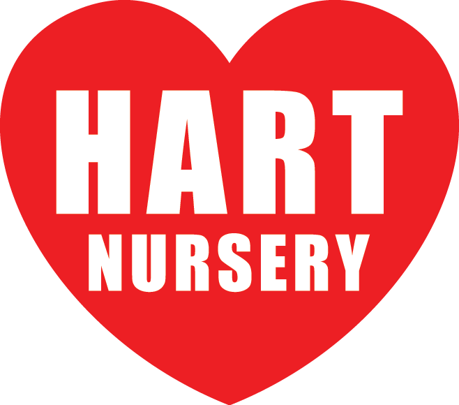
The Hart sisters recently took over the family business. Hart Nursery has been in the family for several generations, setting up shop when the neighborhood was new and sticking it out as homes aged and incomes fell. Today, the neighborhood is changing again. Young homeowners are scooping up properties and renovating old houses into modern homes with classic charm.
GOALS:
The sisters (we’ll call them Julie and Jill) know for sure that they want to update the shop logo, which was actually their initial reason for getting in touch with me. They want to find a way to keep the signature heart, a nod to their last name, without it being quite so red and Valentine-esque. They note that the business has survived all these years on word of mouth. People know their family and know they provide a quality product. However, the neighborhood is changing, and newer, younger homeowners don’t know them. They want to create a peaceful environment where people are welcome to wander and enjoy, and encourage people to build their own peaceful garden spaces at home.

DREAM CUSTOMERS:
Because Hart Nursery is a local, brick & mortar business, their dream customers are a little easier to pin down: they want to serve their neighbors. Since their living merchandise doesn’t travel super well, we know that their ideal customers living within about 30 minutes driving distance. As I noted above, demographics are a big concern for this business, so for a real life client, this would entail lots and lots of research.
Because Hart Nursery is a local, brick & mortar business, their dream customers are a little easier to pin down: they want to serve their neighbors. Since their living merchandise doesn’t travel super well, we know that their ideal customers living within about 30 minutes driving distance. As I noted above, demographics are a big concern for this business, so for a real life client, this would entail lots and lots of research.
OUTCOME:
Based on the client’s goals and our discovery process, we settled on a slight name change: Hart Gardens. The neighborhood has a lot of mature trees and landscapes in existing homes, so most homeowners in their area are looking to build or repurpose their outdoor spaces for specific uses: peaceful reading nooks, outdoor living spaces, and fruit and vegetable gardens. Hart Gardens felt like an appropriate change for their new focus.
The new logo nods to the family name and heritage by using a heart shaped leaf alongside their name. For type, we chose a simple, sophisticated serif font and a pretty, youthful script. The main colors are complemented in the palette by a slightly grayer green, inspired by eucalyptus, and other soft nature inspired hues: a subdued sunny yellow, pale petal pink, morning sky blue, and stone gray. A few simple icons would serve as the beginning of an ongoing project to bring product tags and signage up to date to match the new brand.
ONGOING STRATEGY:
What good is a shiny new brand if you don’t put it to work? Because of the local and visual nature of their products, I would recommend this business ramp up their presence on Facebook and Instagram and create lots of valuable content for their customers such as blog posts, video tutorials, and in-person classes and events. They should also work on growing their email list and reaching out to subscribers with all that amazing content, learning opportunities and yes, sales and promotions.
YOUR TURN:
Is your business at a turning point? If so, it might be time for a brand refresh or a total rebrand. I’d love to get on a call with you for free to chat about it! Click here to find a time that works for you.